
Case Study
Website Transformation for a Local Beauty Brand
We redesigned and repositioned a local beauty salon's digital presence into a premium, conversion-focused revenue system — aligning luxury positioning with mobile-first local search behavior.
130%
Improvement in Customer Loyalty
86%
Boost in Sales
100+
Successful Branding Projects
200%
Increase in Brand Recognition
Client
Confidential — Las Vegas
Industry
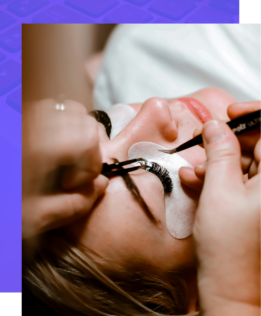
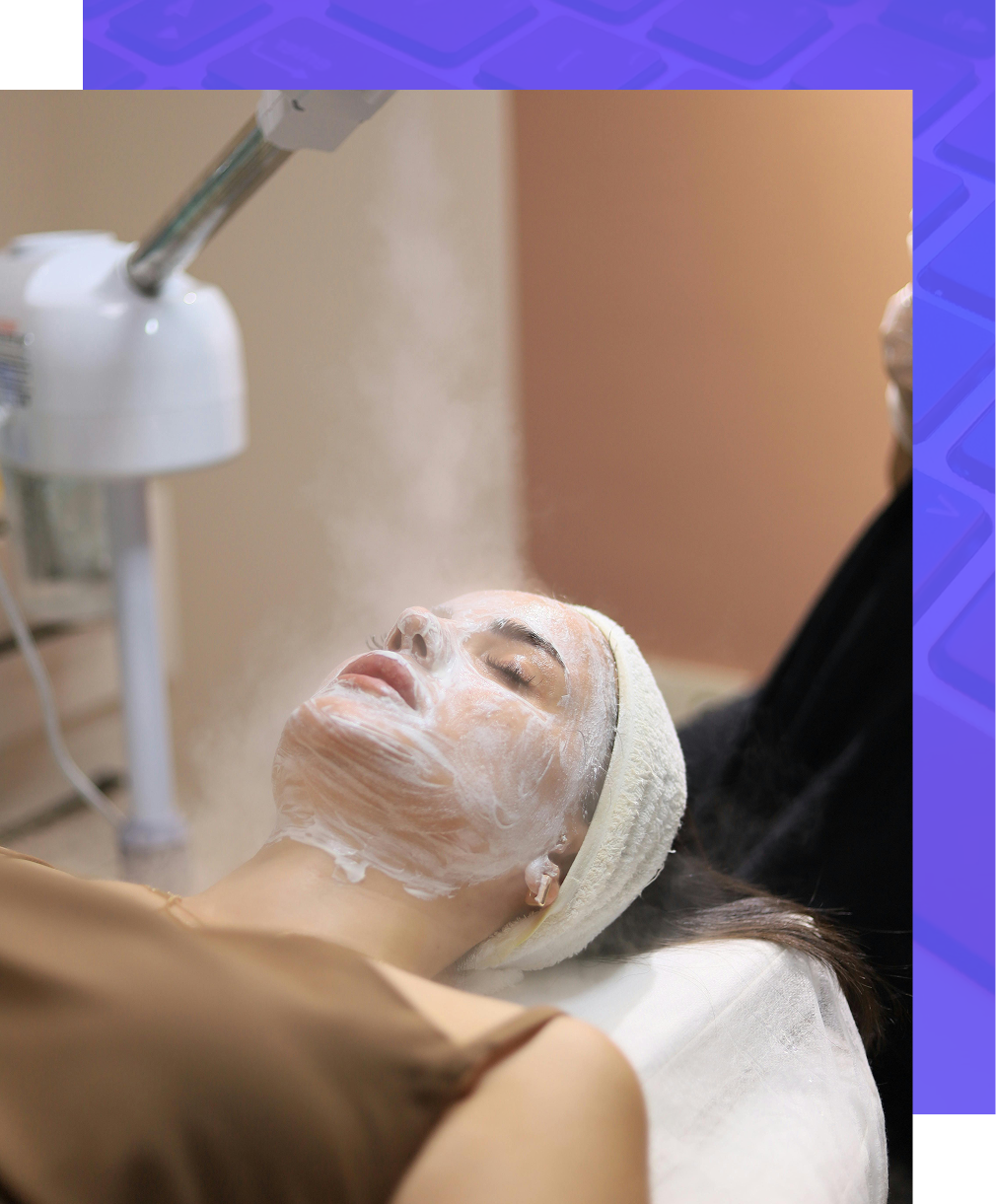
Beauty & Wellness
Services
Web Design · Conversion Architecture · Paid Media
Timeline
18 Days Post-Launch
17.96%
Conversion Rate
67
Conversions in 18 Days
12,473
Local Profile Views
843
Profile Interactions
Objective
Convert Existing Demand Into Revenue
The brand had demand. The website was not converting it. We were brought in to redesign and reposition the digital experience to reflect a premium, luxury standard — while increasing booking conversion rates, supporting both service acquisition and stylist recruitment, and aligning the entire system with mobile-first local search behavior.
The Problem
A Website That Worked Against the Brand
The existing site suffered from a disconnection between the quality of the in-person experience and what the digital presence communicated. It was leaving revenue on the table.
Outdated visual identity that undercut premium pricing
No clear positioning — generic salon feel
Weak conversion structure with no call-to-action hierarchy
No service segmentation or browsing logic
Limited trust signals and social proof
Poor alignment with mobile traffic behavior
No recruitment pathway for booth rentals
Strategy
A Conversion System, Not a Visual Upgrade
We approached the redesign as a revenue system — every design decision tied to a measurable business outcome. The strategy centered on six core pillars.
01
Luxury Positioning
Visual identity that justifies premium pricing and elevates market perception.
02
Mobile-First Experience
Designed for how users actually arrive — 90%+ through mobile Maps discovery.
03
Service Segmentation
Clear visual hierarchy across offerings to reduce decision friction.
04
CTA Flow Architecture
Strategic placement of conversion points throughout the user journey.
05
Trust & Credibility Layering
Integrated social proof and review signals at decision-critical moments.
06
Dual Funnel Support
Parallel conversion paths for client acquisition and stylist recruitment.
Execution
Building the System
Brand-Driven Visual Design
We implemented a black-and-gold luxury aesthetic with high-contrast typography, editorial-style imagery, and deliberate spacing hierarchy. The brand now visually communicates premium value and justifies higher ticket pricing.
Black + gold palette
High-contrast type
Editorial imagery
Intentional spacing
Conversion-Focused Layout
The homepage was structured to guide behavior through a deliberate funnel — from emotional hook to booking action.
Visual hook + positioning
Immediate booking pathway
Service category navigation
Brand story section
Review integration
CTA reinforcement
FAQ friction removal
Contact + hours for local
Service Segmentation
Instead of a generic list, services were structured visually and logically — improving navigation clarity, reducing decision fatigue, and shortening time-to-book.
Lashes
Nails
Brows
Spray Tan
Hair Removal
Makeup
Teeth Whitening
Tooth Gems
Dual Funnel Integration
The site was engineered to serve two distinct audiences with parallel conversion paths — without creating navigation confusion.
Customer Funnel
Browse services with visual navigation
Build confidence through social proof
Book appointments with minimal friction
Recruitment Funnel
"Rent a Suite" navigation path
Clear booth rental interest pathway
Supports recurring revenue model
Trust & Social Proof
We integrated client testimonials, visual review cards, and Google + Yelp credibility indicators — placed at the decision stage to reduce hesitation when it matters most.
Mobile-First Optimization
With 90% of discovery coming through mobile Maps, the entire experience was built around how users actually arrive — fast loading, thumb-friendly navigation, clear CTAs, and minimal friction.
The website did not create demand. It converted it efficiently.
Transformation
Before vs. After
Before
Generic salon presence
Low perceived value
Weak conversion flow
No recruitment support
Desktop-default layout
After
Luxury beauty positioning
Conversion-focused structure
Clear service pathways
Integrated recruitment funnel
Mobile-optimized experience
Key Takeaways
What This Proves
01
Design impacts pricing power. Premium visuals justify premium pricing.
02
Structure impacts conversion rate. Layout decisions are revenue decisions.
03
Mobile behavior must dictate layout. Design for how users actually arrive.
04
Local businesses need dual funnels — customers and talent, on the same site.
05
A website should support revenue, not just branding. Build systems, not pages.
Ready to Turn Your Website Into a Revenue System?
Let's architect a digital experience that converts demand into measurable growth.